Concept development
Design development
Art direction
Animations: Toby&Pete
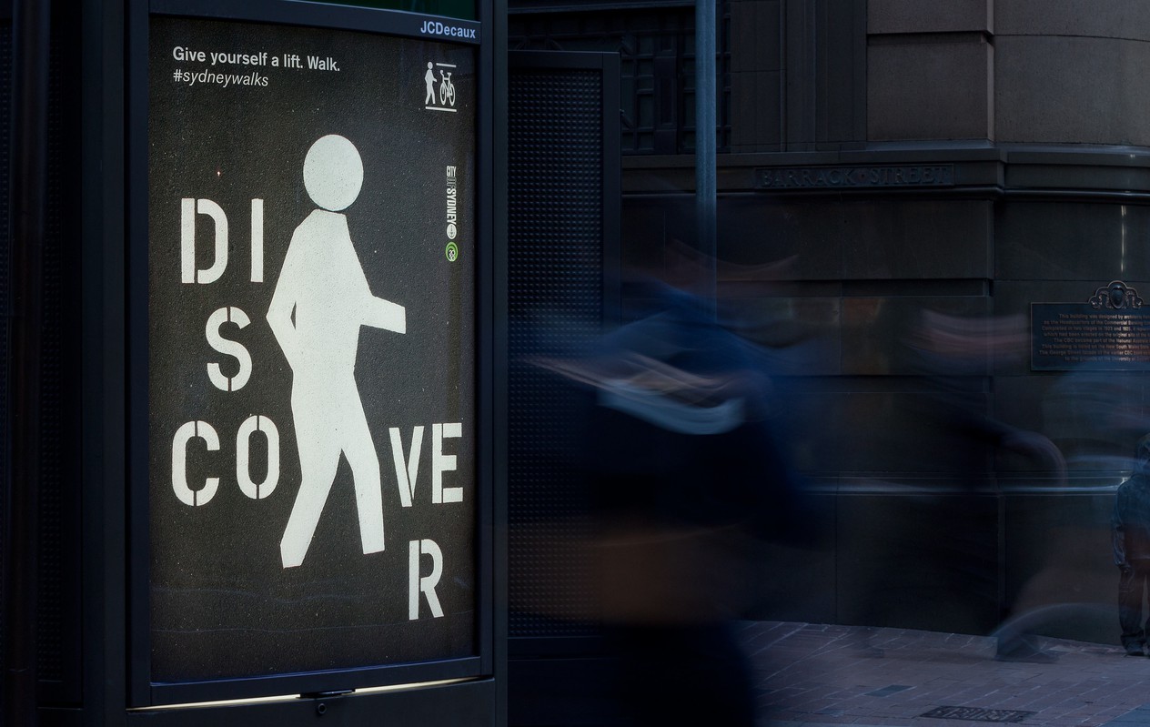
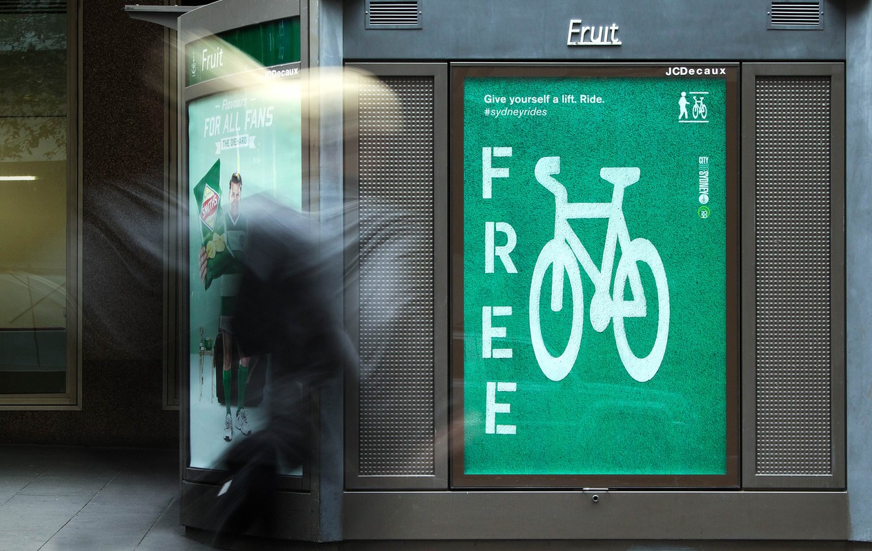
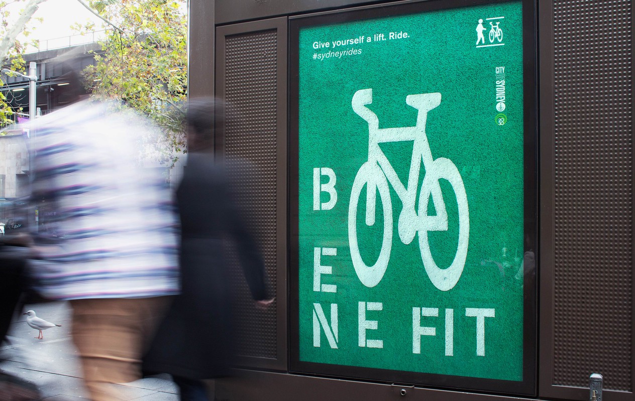
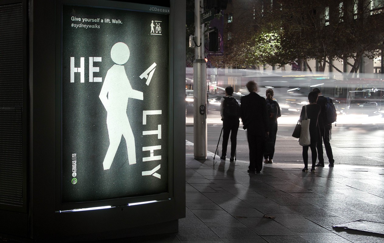
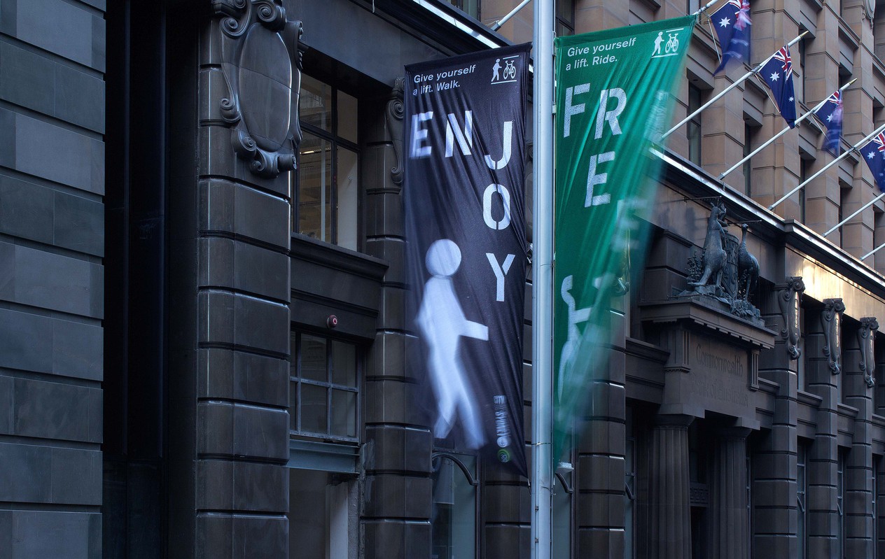
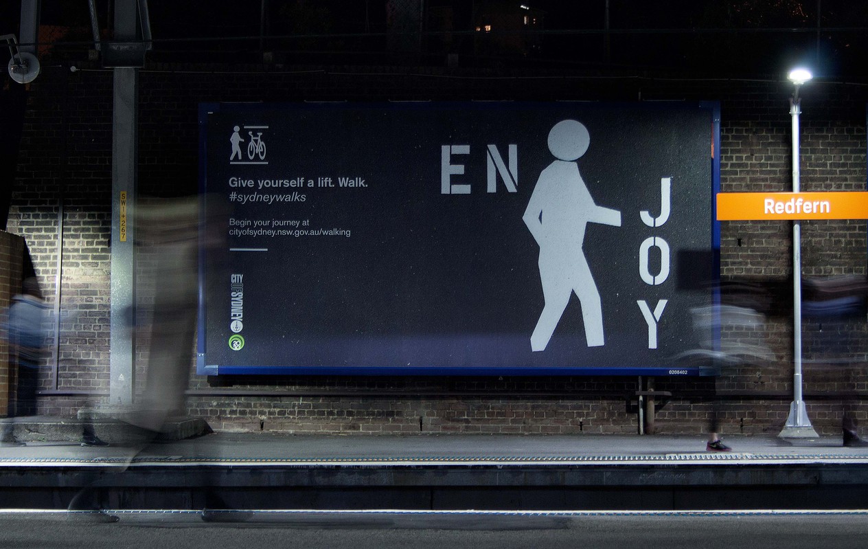
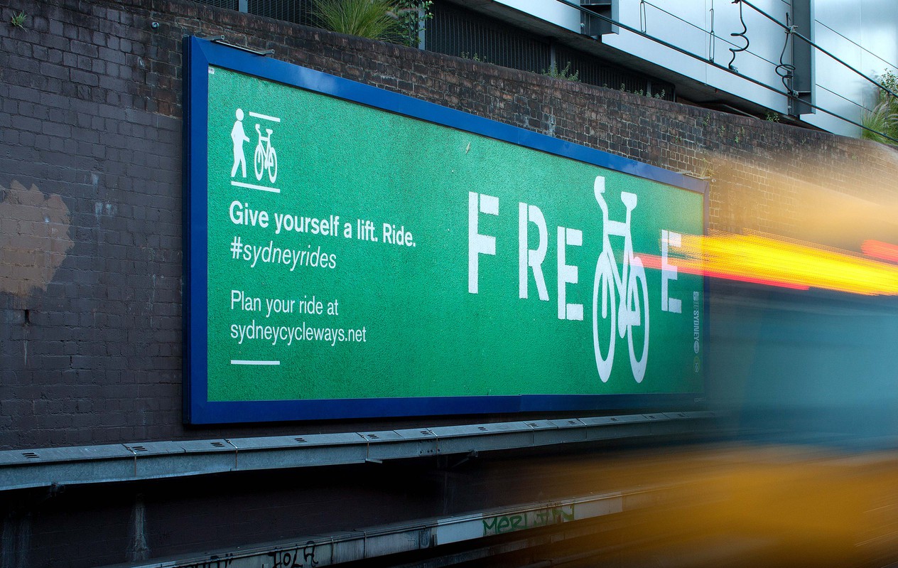
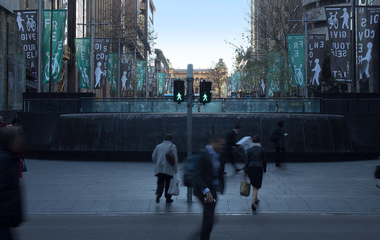
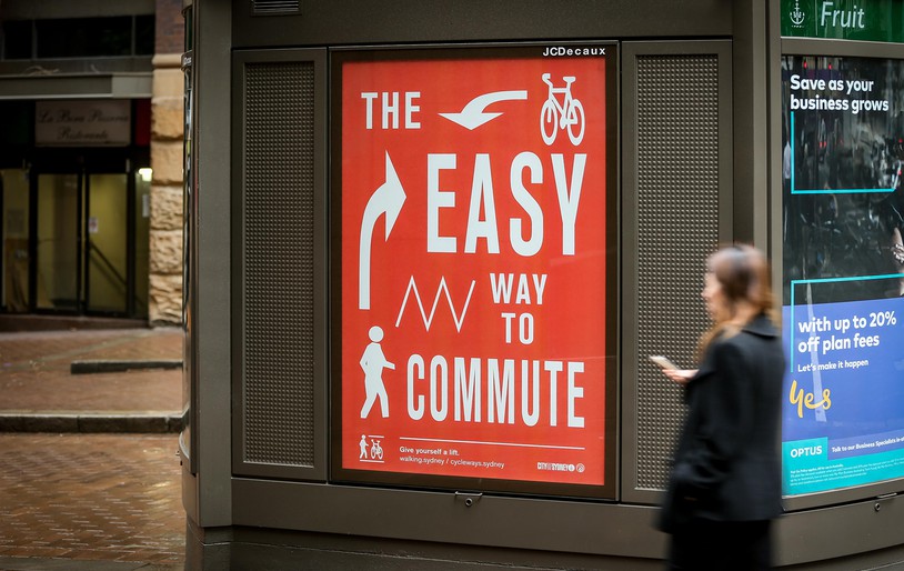
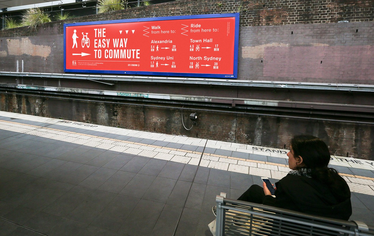
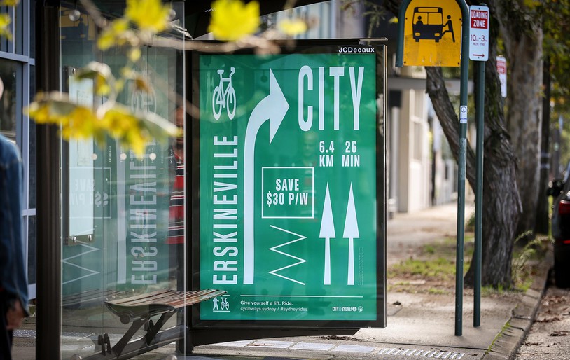
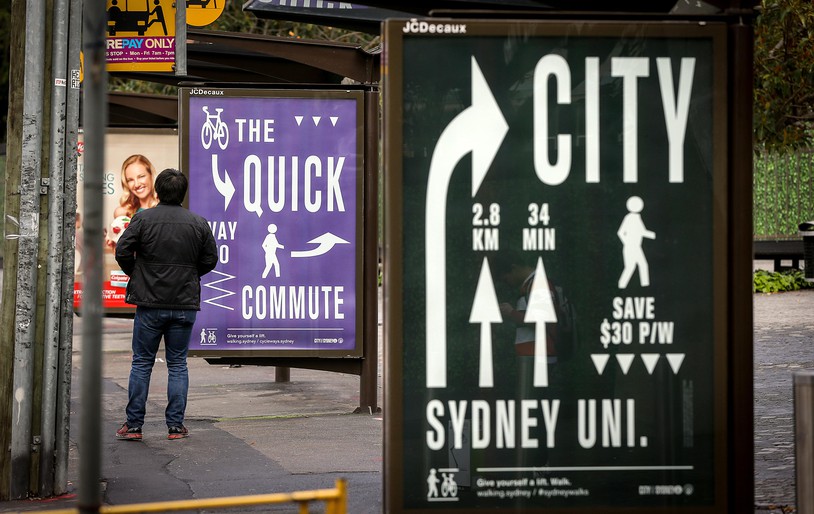
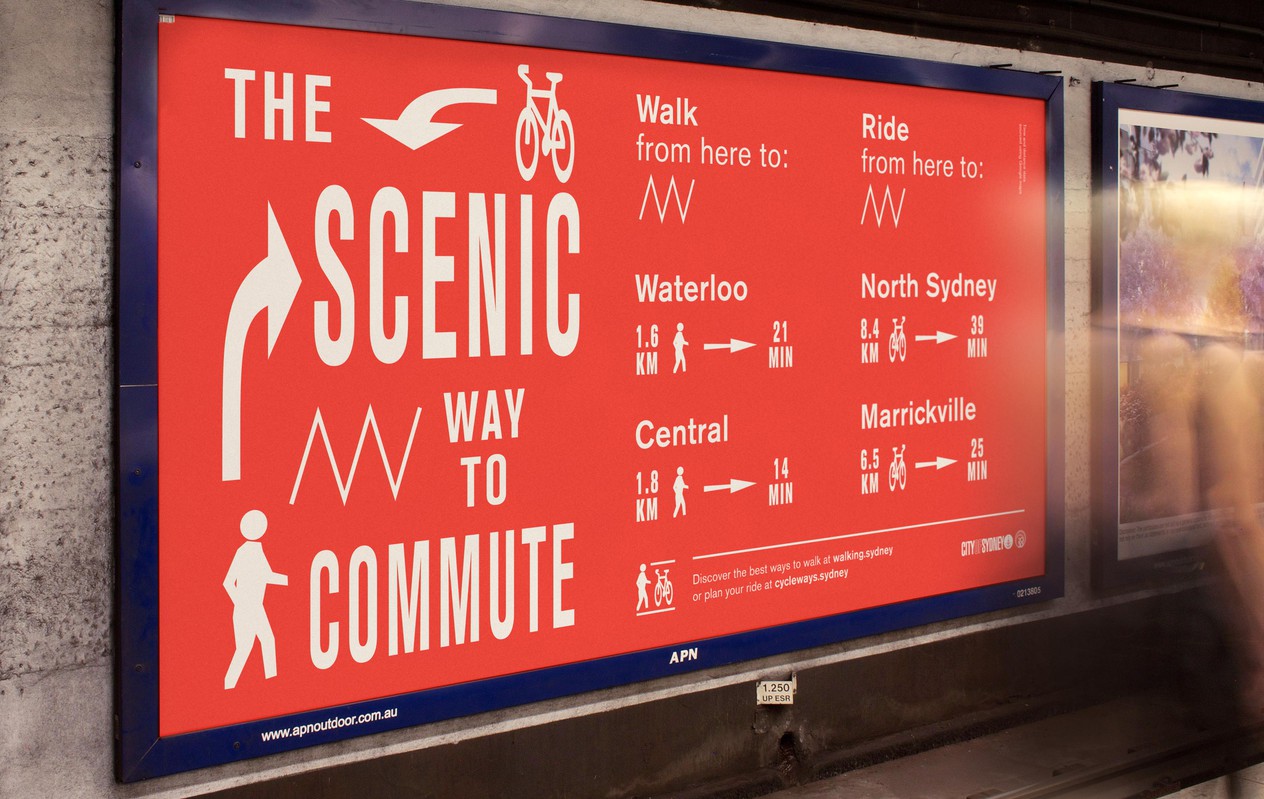
The brief: Conceptualise and develop a series of campaign images that present walking and riding as viable transport options that are cheaper, more reliable and often quicker for short trips. Essential criteria: Positive; no negative ‘targeting’ of drivers or public transport, clear, concise and straight-to-the-point messaging, equally relevant & readable for all road users, flexible creative that is suited to different applications and formats.
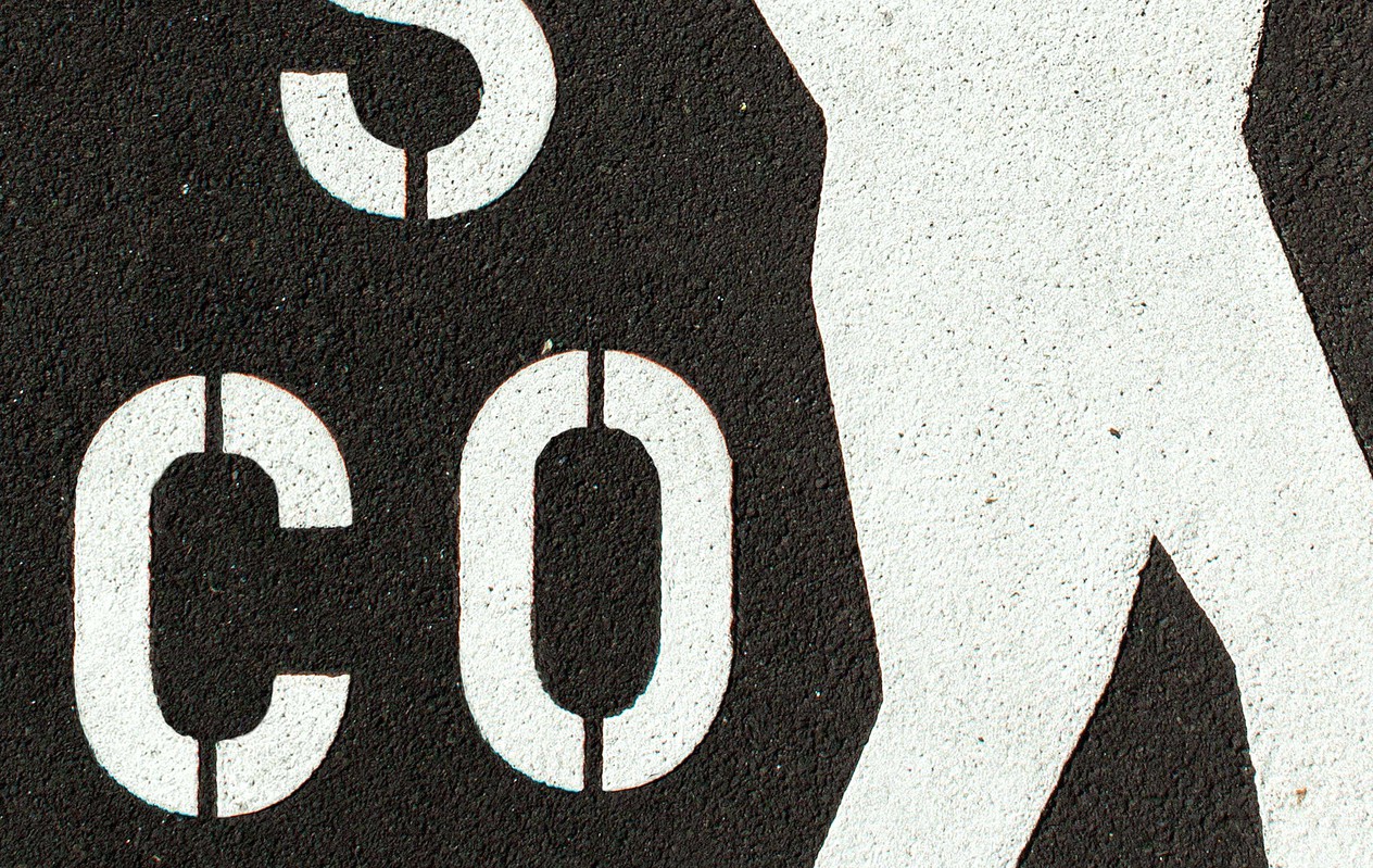
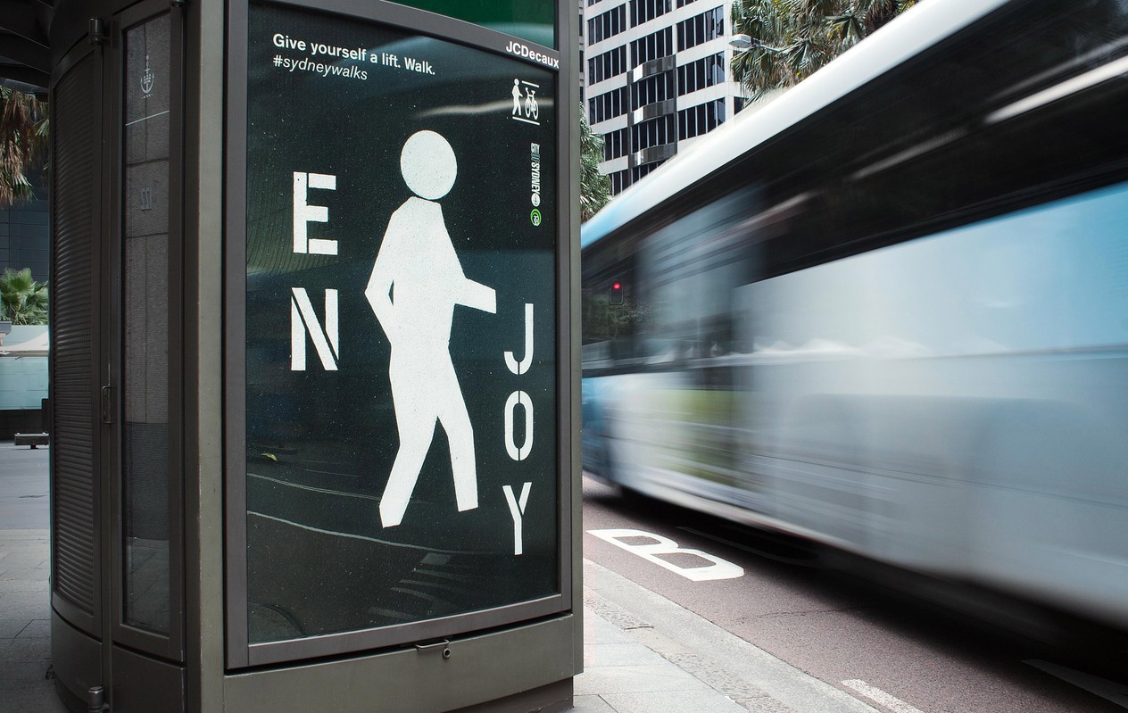
The 2016 campaign utilises the iconic stencil we all know so well. The campaign creates awareness and the actual street stencil keeps reminding us of it. A small campaign with a big impact and massive reach.
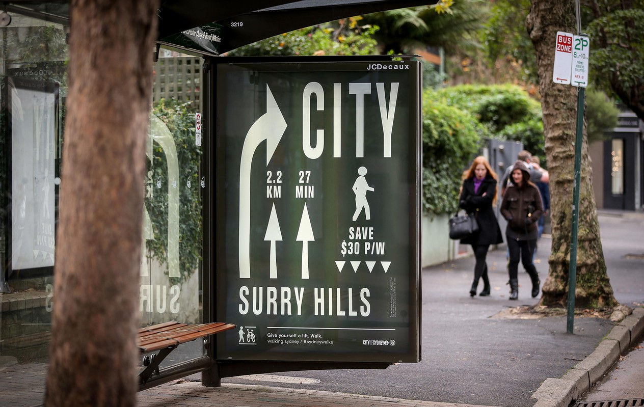
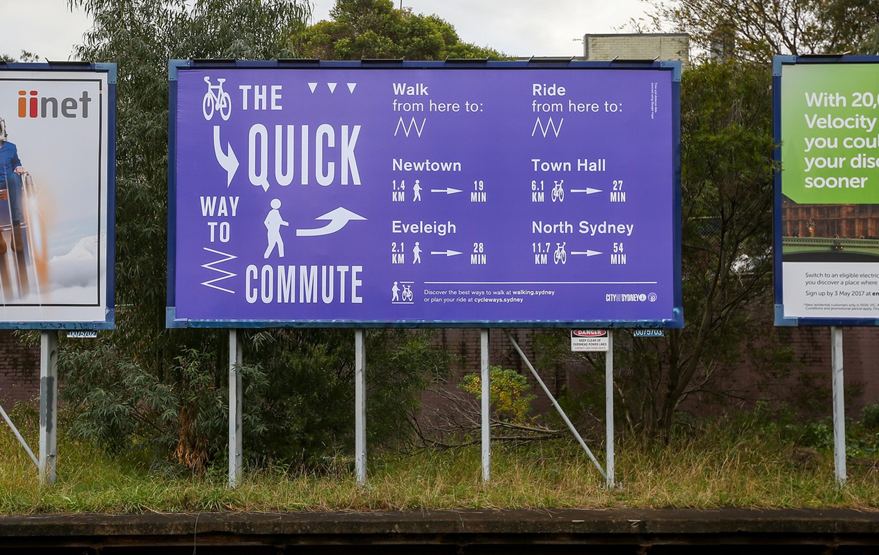
The 2017 campaign messaging is tailored to specific train or bus stations showing the relevant walking or cycling distances from A to B, both in time and distance. Informative messaging.
